Empire Skate | UX
Empire has a long-established history as one of New Zealand’s leading skate and street suppliers. Recent growth has allowed the supply of an exponentially greater brand list to complement their core products.
With a website almost as old as the brand itself, usability issues were rife. I helped identify navigational issues and design an updated aesthetic while retaining brand familiarity. A robust search function and dynamic collection pages were specifically implemented through the Shopify platform to address the expanding inventory. A modular square layout was also ported from the original design to incorporate a shoppable Instagram mosaic.
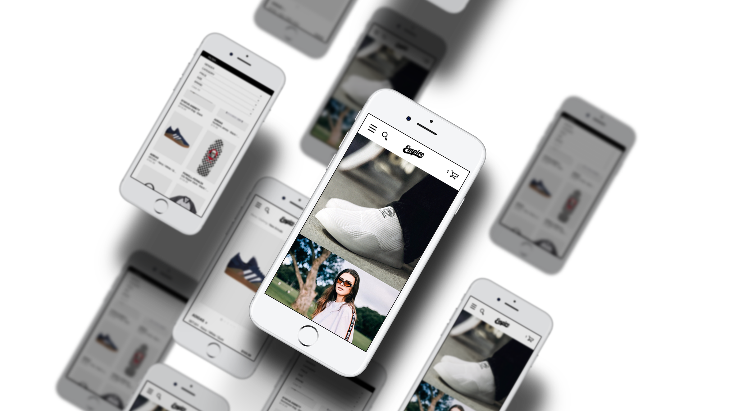
The live website had been developed a few years ago and was not particularly responsive. Landscape-oriented banners would scale poorly on mobile, compromising aesthetic scale and navigation. The site also did not scale well for product categories. The filter menu would isolate particular product groups by one variable and this had to be deselected to return to the full collection. This was exacerbated by the primary navigation being strictly laid on a hamburger menu, and this was also the only place where the search function could be accessed. We wanted to promote the search feature more prominently to future-proof relevant results going forward.

The first step was to call collections with custom tags which would create more dynamic options. All inventory items were merged with additional characteristics to achieve this. The filter options and search bar would also be able to call on these to create a robust search feature. The search would then be at the top of the homepage to allow for easier searching. Shopify plug-ins were found which could interpret the custom tag information to easily implement these features. The filter bar would also follow the screen down the mobile page for better access as the collection pages grow in size.

With new collections, a custom landing page for collections could be populated easily, requiring a more streamlined process. All info pages were already laid out the same way as the blog so this could be continued. The conventional Shopify cart/checkout features already worked well so these did not need to be touched.
The home page would also follow a simple square grid format to tie in with a shoppable Instagram feature. These posts are dynamically updated and would make maintenance easier as seperate banners would not have to be made for all iterations of a new campaign. This would also translate seamlessly between mobile and desktop because of the square grid. A header navigation would ideally exist on desktop for quick access to sorted collections and popular products. The accounts section and fashion blog saw significant use so we wanted to create a secondary navigation to access these.
Familiarity would be key in retaining our brand identity, but simple updates to existing iconography and typography would benefit the cleanliness of the site. Many of the menus and icons were also hard to use and misaligned so these would be addressed too.


This prototype was given to an external developer but time and money became clear constraints. We opted to develop the website in-house under the leadership of Matt Wells instead. This would allow us to control the website in-house and easily make future modifications/revisions. Through iteration, we considered the following:
Many retailer assets were in landscape format and cropped poorly.
A dynamic non-square grid was implemented to solve this issue.
Follow filter was complicated and replaced with a standard feature.
Blog and accounts could be adequately accessed on hamburger menu.
Social media icons were too small on menu and moved to page footer.
Aesthetic was stripped back to allow for easier development.

The website was released with a similar but cleaner font, black header and mega menu to better accomodate the large collection of products. Logos were also added to collection pages to better identify the spread of products. A size and quantity indicator was also added to the items to add urgency, while a quick shop button would allow an internal window to show a refined version of the product page. The blog and account features were moved to the top bar to allow easier access on desktop, as well as quick access contact/social media links. This bar can also be utilised during promotions to display a promotion. Since launch, the website has seen a significant increase in conversions and lower bounce rates. As the project continues, our next step will be to optimise website speeds and convert product imagery for scalability with Imagekit.
